The View From The Shard
Brand
Print & digital deliverables
Events
Brand
Print & digital deliverables
Events
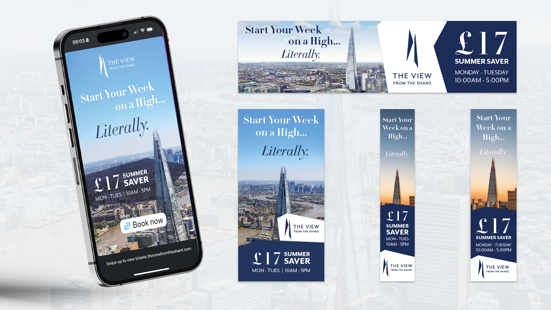
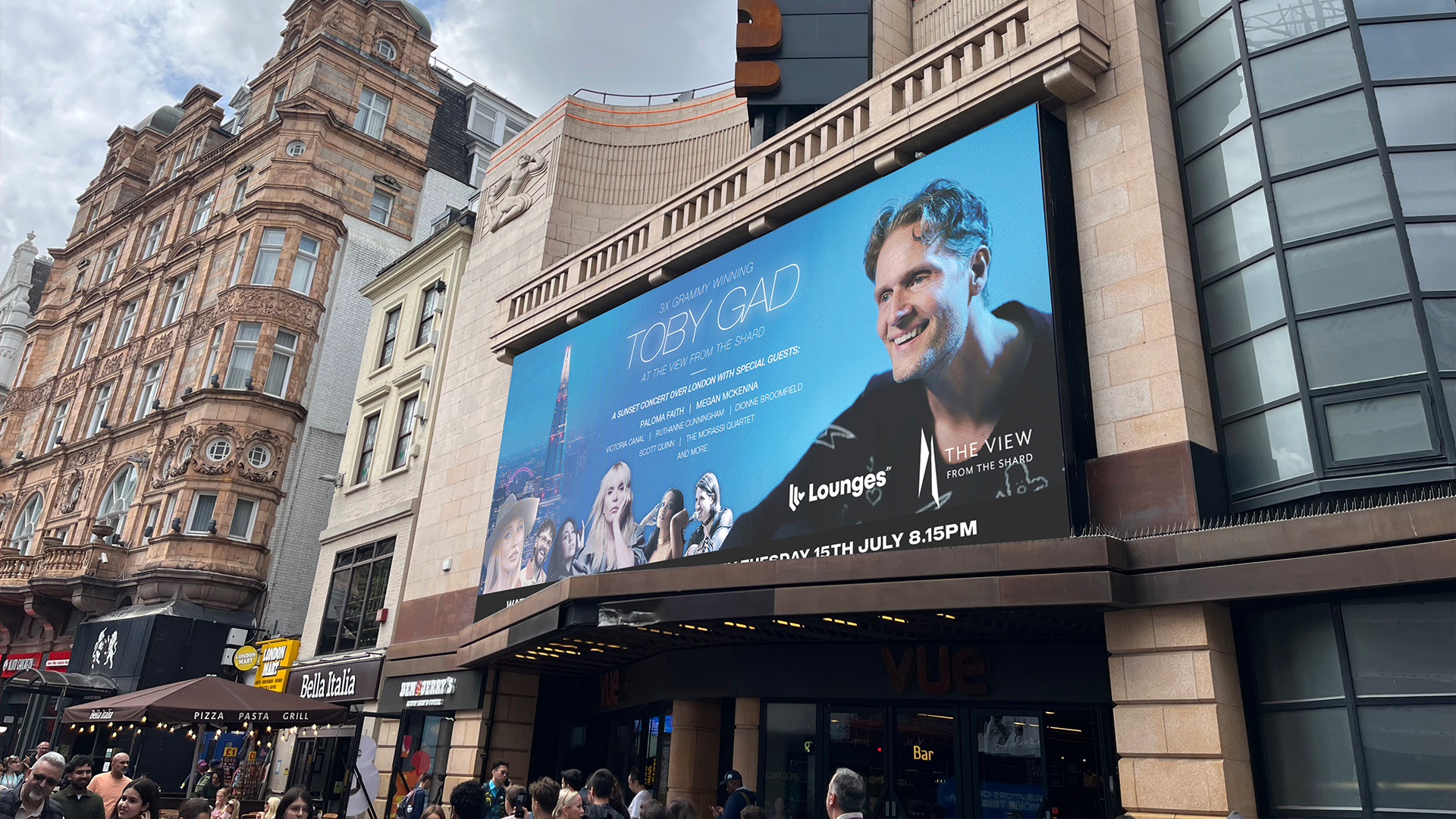
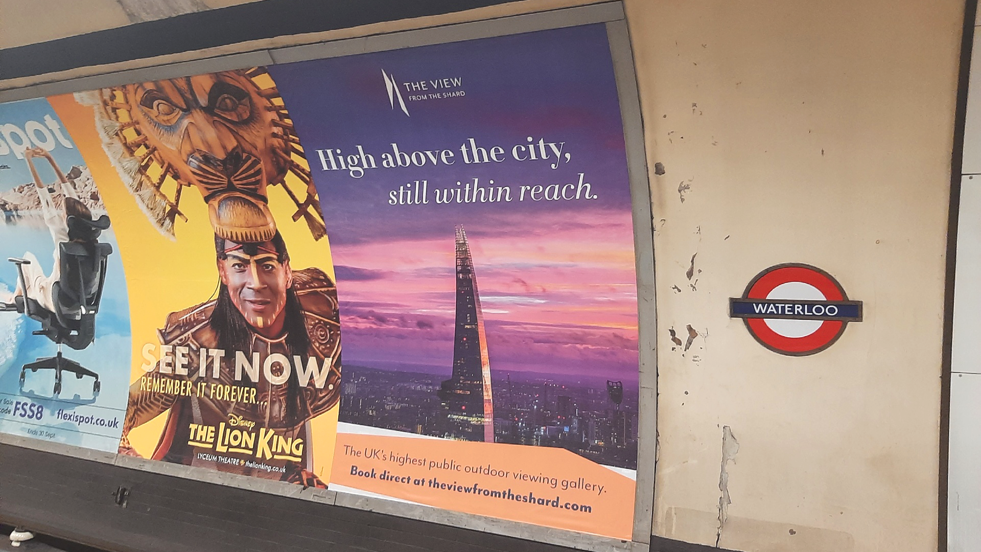
Full service creative & marketing for The View From The Shard.
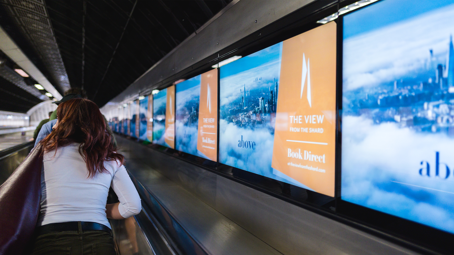
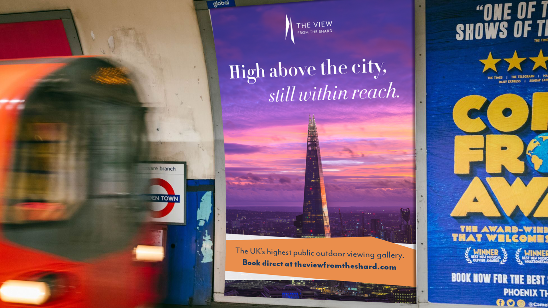
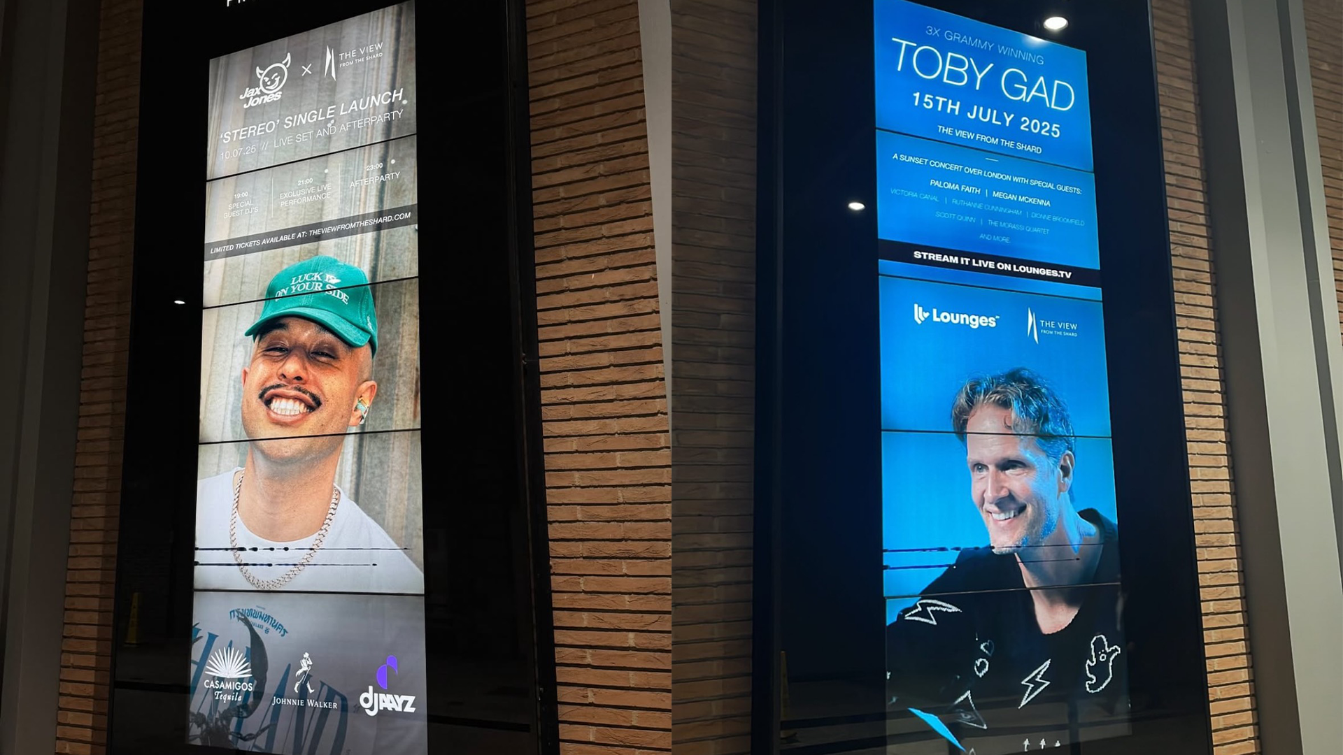
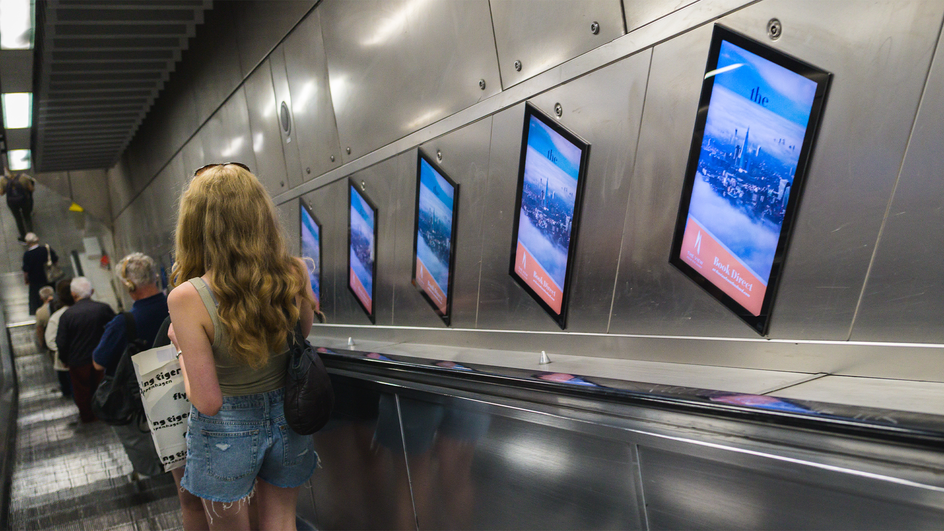
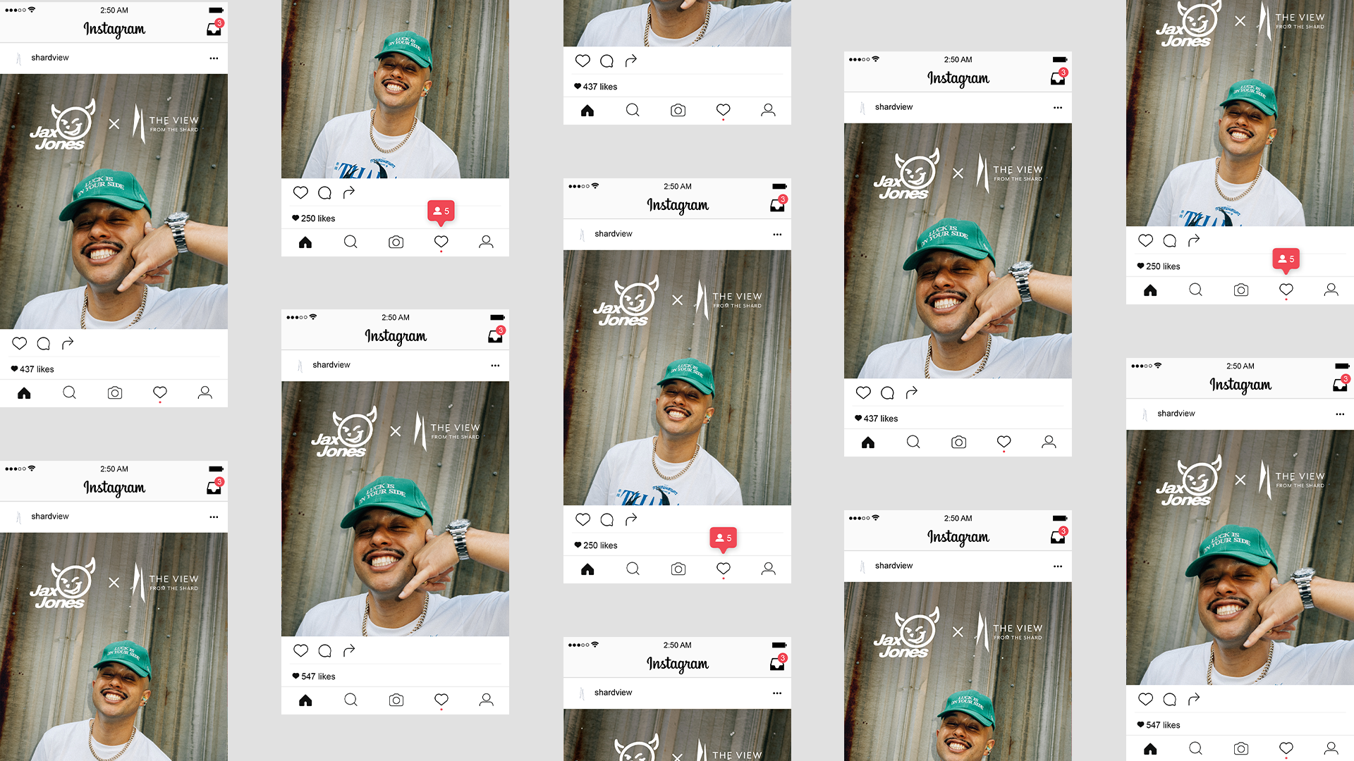
Deliverables include visuals for campaigns, on-site events, signage/digital signage/billboards and socials.
Goal for TVFTS was to reduce the use of 3rd party ticket selling sites & turn the venue into more of a destination landmark and not just another viewpoint for London.
Deliverables include visuals for campaigns, on-site events, signage/digital signage/billboards and socials.
Goal for TVFTS was to reduce the use of 3rd party ticket selling sites & turn the venue into more of a destination landmark and not just another viewpoint for London.

Energy Vault
Brand
Print & digital deliverables
Exhibition stands
Web
Brand
Print & digital deliverables
Exhibition stands
Web
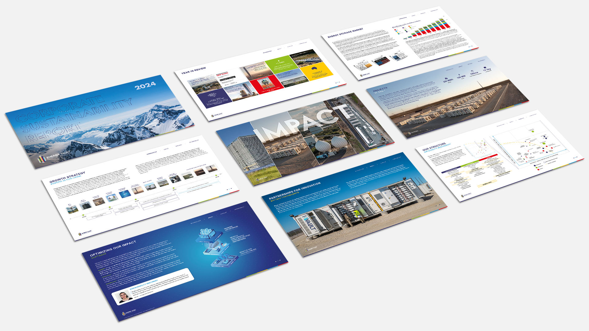
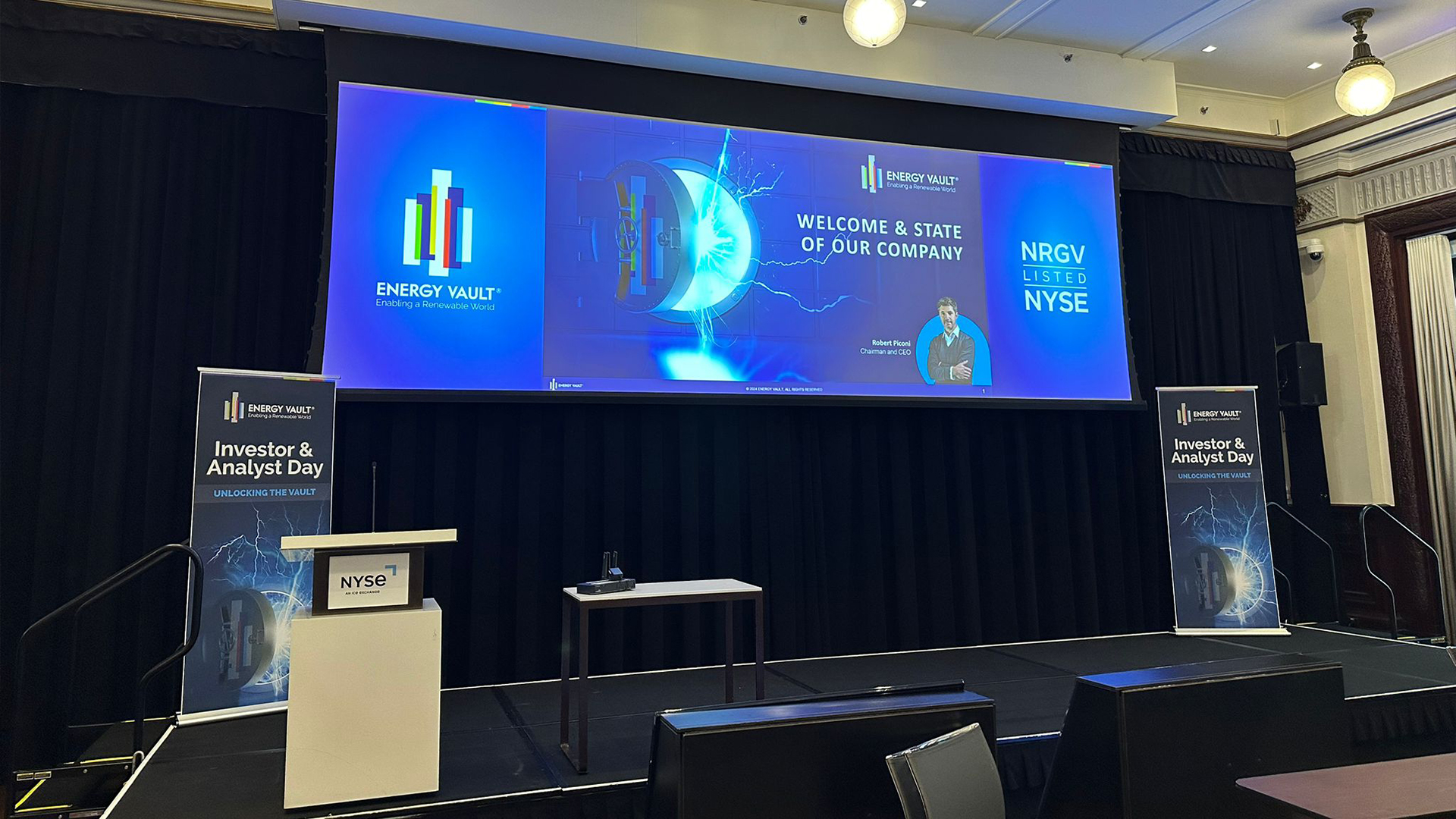
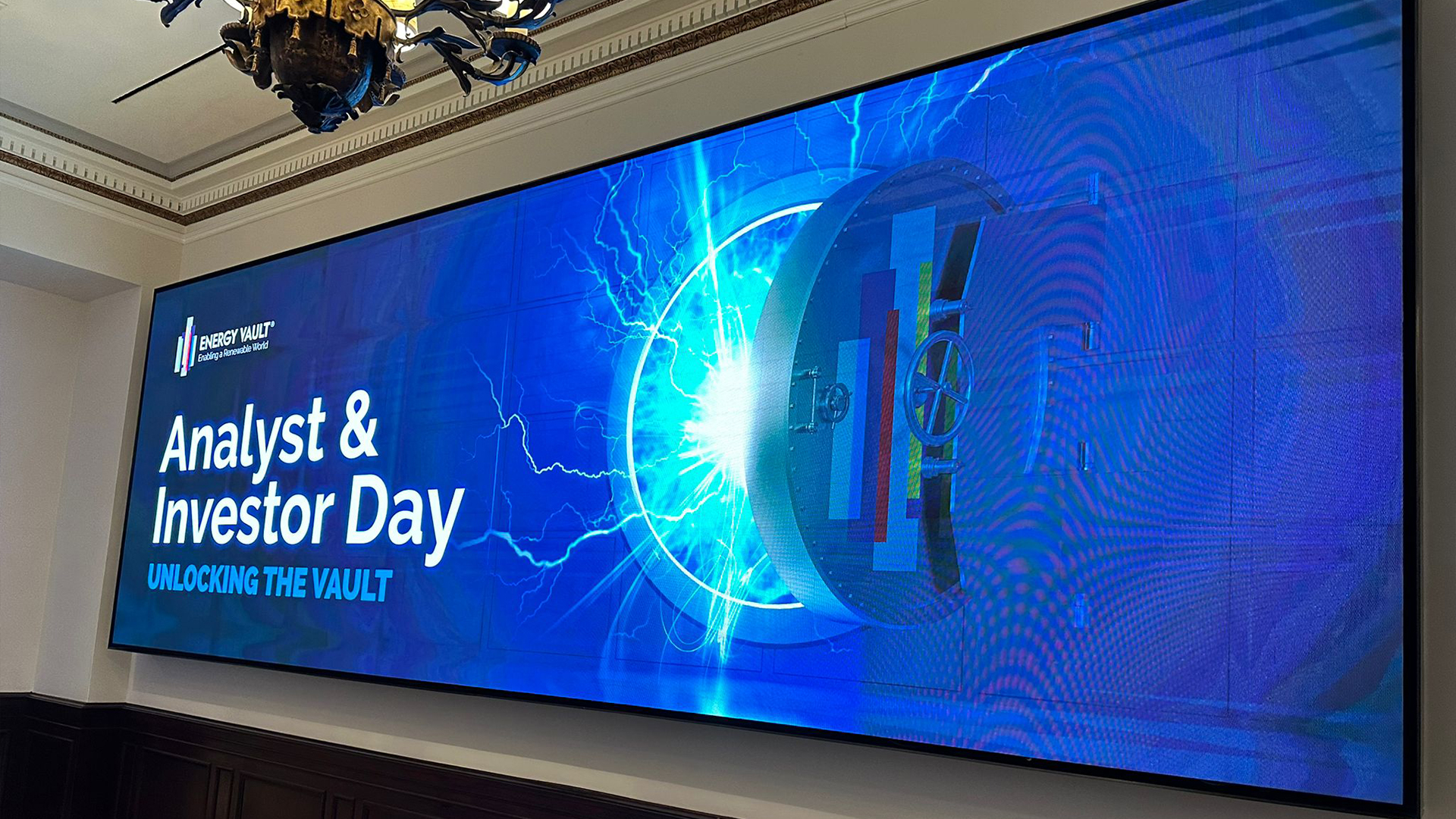
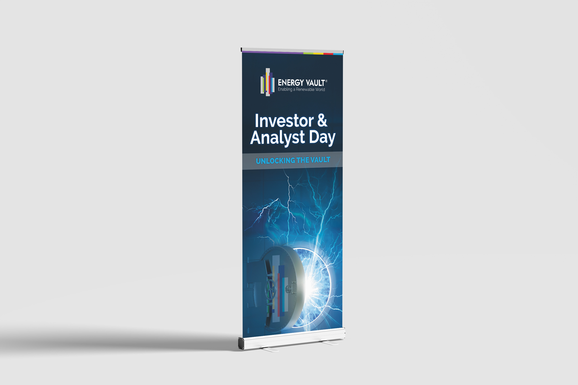
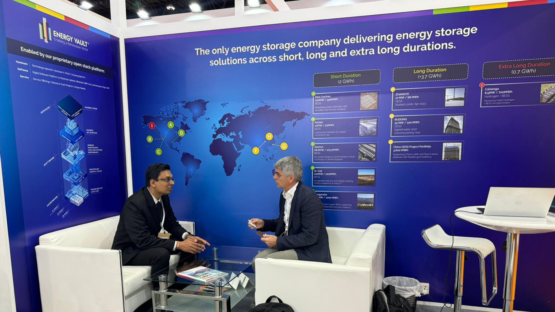
Full service creative for renewable energy storage company, Energy Vault.
Deliverables include visuals for global events, NYSE investor days, sustainability reports, presentations, socials, website design & prototyping amongst others.
I was also tasked with maintaining and progressing the brand based off directors’ wish to push the brand in a more visual, tech focussed and infographic-like direction.



Riester GmbH.
Brand
Print & digital deliverables
Exhibition stands
Web
Brand
Print & digital deliverables
Exhibition stands
Web
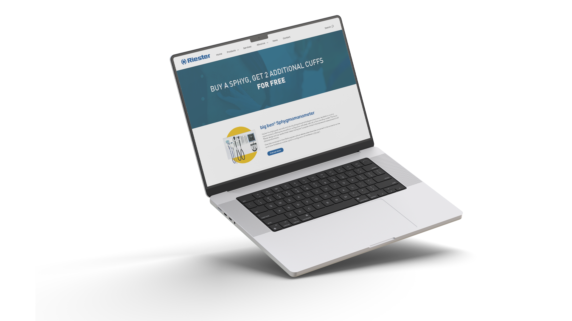
Full service creative for German medical equipment company, Rudolph Riester GmbH.
Major projects include multiple events throughout the calendar year, reports and PDFs to be shared with distributors, social channels and landing page design to name a few.
Brand has been constantly evolving since I started working on it, with a push to start making the ‘Riester blue’ an instantly recognised industry colour.


Forty9
Brand
Socials
Presentation
Web
Brand
Socials
Presentation
Web
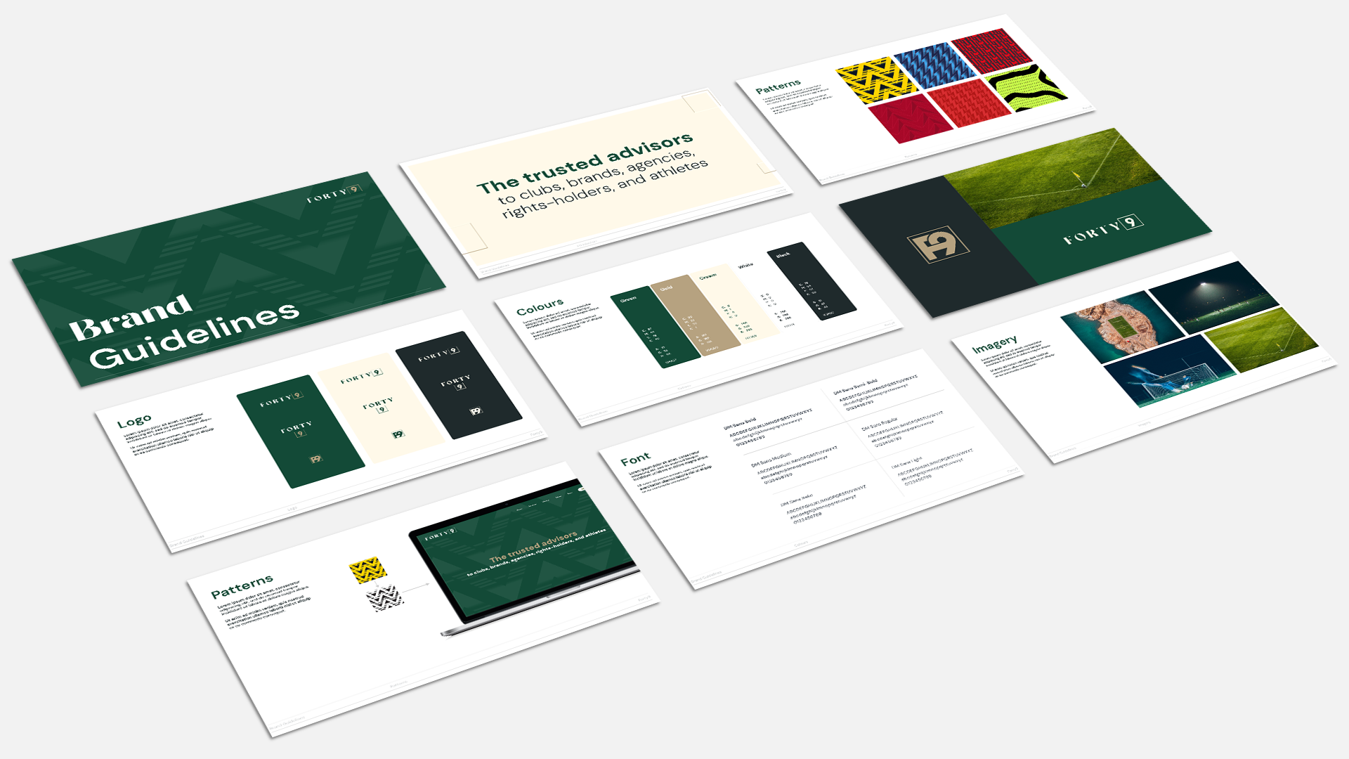
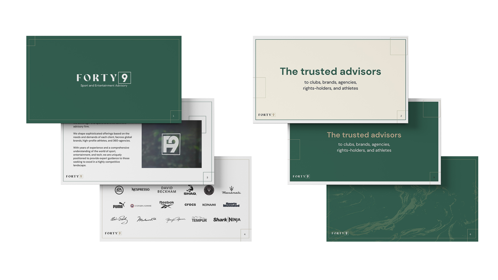
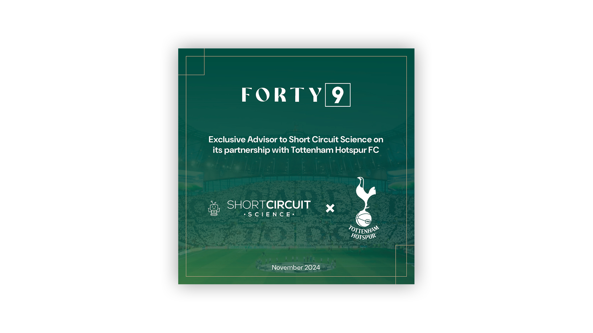
Initial creative for enertainment advisory firm, Forty9.
The 49 being a nod to the owner being an avid Arsenal fan and giving a nod to ‘The Invincles’ season from 03-04. To apply an element of this to the brand we used various patterns from iconic Arsenal kits over the years throughout, the main one being the pattern form the ‘raspberry ripple’ away kit from the 20-21 away kit.
Initial deliverables for the brand was identity & brand guidelines, website design, initial socials and presentation template.
Website viewable at: weare49.com

WMC Ltd.
Brand
Print & digital deliverables
Exhibition stands
Web
Brand
Print & digital deliverables
Exhibition stands
Web
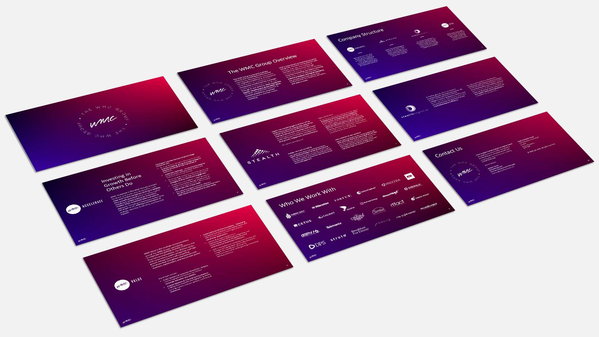
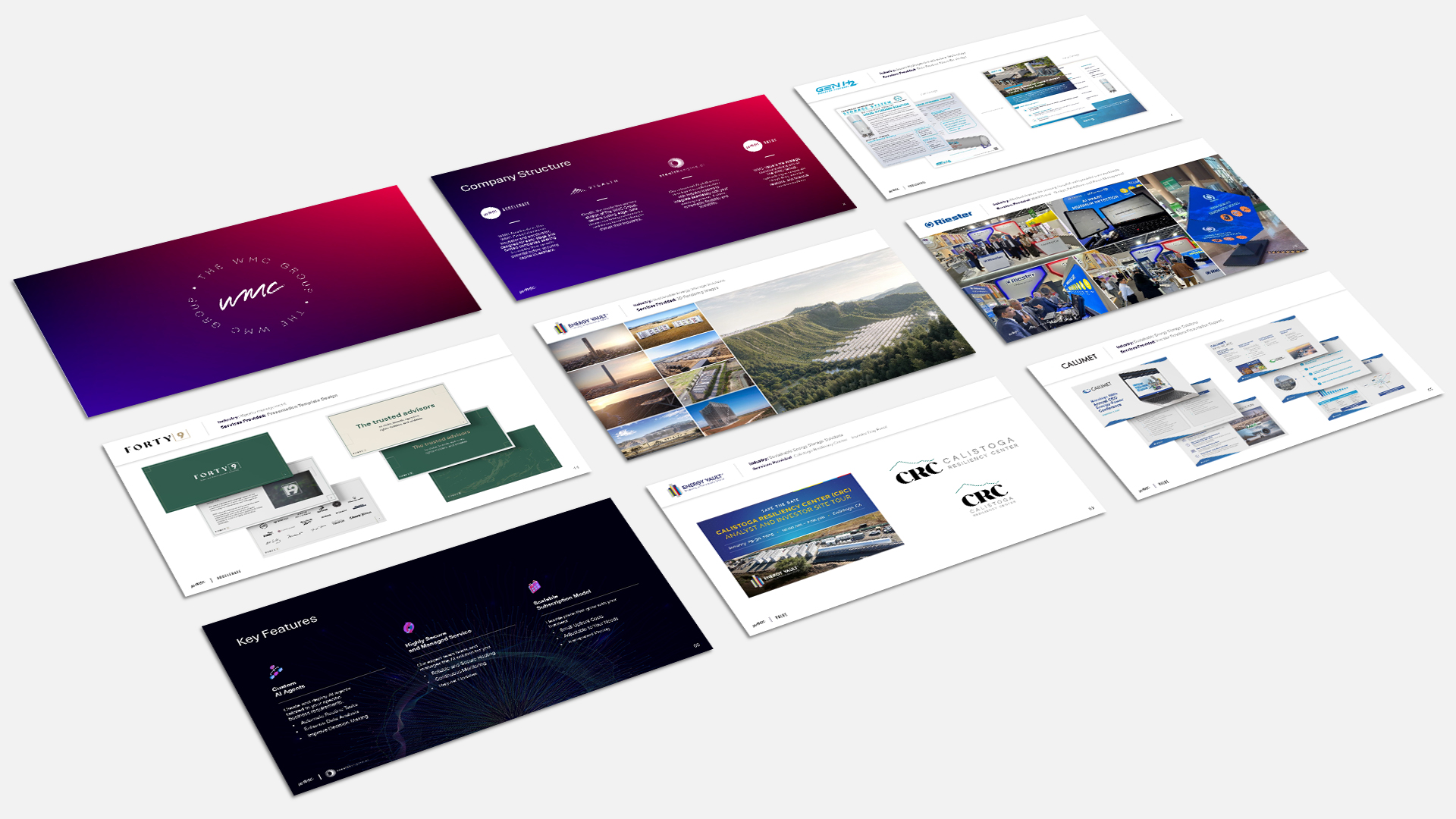
Rebrand for digital marketing agency WMC Ltd. (Wantley Manor Consultancy Ltd.)
As the company has grown so has the areas of focus for agency to specialise in. This resulted in the formation of the ‘group’ concept. Within this the agency rebranded its name and created 4 sub brands, each with a different focus and speciality.
Asset creation for this so far has been the creation of identities for the group and its four sub-brands, landing page style home page and presentation assets to show the agencies work to prospective clients.
